Saturday 27 July 2013

The Other Woman - designing Abigail Hardwoode


My initial sketches for the look of The Other Woman's heroine Abigail Hardwoode, following a description from author Graham Thomas. The Other Woman is available now here for kindle or in paperback.

Tuesday 16 July 2013

The Other Woman - cover illustration


It would have been appropriate had I managed to post this on bastille day, but here only a couple of days late is the finished cover to the Second installment in Graham Thomas' Roxy Compendium - The Other Woman. In this prequel to Hats off to Brandenburg, Abigail Hardwoode takes centre stage in a bid to save her family against the backdrop of Revolutionary France.


Wednesday 3 July 2013

The Other Woman turns her back


My design for the back of forthcoming Roxy Compendium entry The Other Woman. Included is a little insight into the story, set some time before the events of Hats off to Brandenburg, and a visual hint that we might be in for a splash or two of the red stuff.

Monday 24 June 2013

Bertie and Bean character designs


Two different approaches for character designs for the Bertie and Bean website.

Thursday 20 June 2013

Three Grandfathers


Exploring colour/texture options for a Grandfather character I drew for a Children's book set in Kenya.

Wednesday 12 June 2013

The Roxy Compendium Book 2 - AKA...


Here's the title banner I created for the follow-up to 'Hats off to Brandenburg'. Should be with us later this summer. More details soon.

Monday 10 June 2013

Blonde bomber


Just testing out some different approaches to rendering with Photoshop and Painter. The subject is a sketch I did for a character who appeared on this Bondish Misery Bear illustration.

Tuesday 28 May 2013

Coming Soon . . .


The Roxy Compendium - Book 2

Wednesday 22 May 2013

Railsea - finalising the cover


The final stage of the development of my Railsea cover called for me to come up with a suitable colour palette and custom lettering for the title. As I'd been asked to work on the book based on other covers I'd created in the style of vintage movie posters and pulps, it made sense to mine this rich vein some more.

The colourway below came about from me noticing what a common combination this intense orange/red with a cobalt blue was in the advertising and magazine cover design of the 30s. They are complimentary colours and so are naturally seen together no matter what the decade, but they seemed particularly common in this saturised form in the 30s and 40s.


This colour combo looked incredibly intense to me after submitting it and I didn't expect my Art Director to buy into the idea, but surprisingly they loved it.

When it came to submitting a second colour rough (with some alterations to the colours and train design) I still had not looked seriously at developing custom lettering for the title. Wanting to suggest the area to be used for the title however I quickly cut and pasted something together from a poster for 40s seafaring adventure movie Reap the Wild Wind


I hadn't really intended this to be the final look for the title but once again the design team liked it and wanted something pretty close to this for the final cover. To help refine the lettering I turned to pulp cover design again, this time Air War -


Below is my final concept for the cover including finished lettering, as submitted to Pan Macmillan. Before it went to print the Blue colour of the title would revert to the original white of the rough, and the 'pulpular' type used for the author credit would be replaced by the distressed font used for the Mieville adult covers (to keep an association with the brand). Nevertheless this is pretty close to the cover you'll find on the shelves.


Railsea is available now from your local bookstore, or online. You can still read the first two chapters online here.

Tuesday 14 May 2013

Railsea - route 2


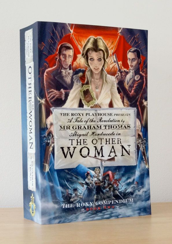
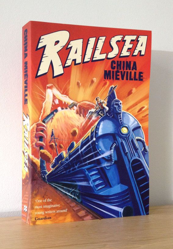
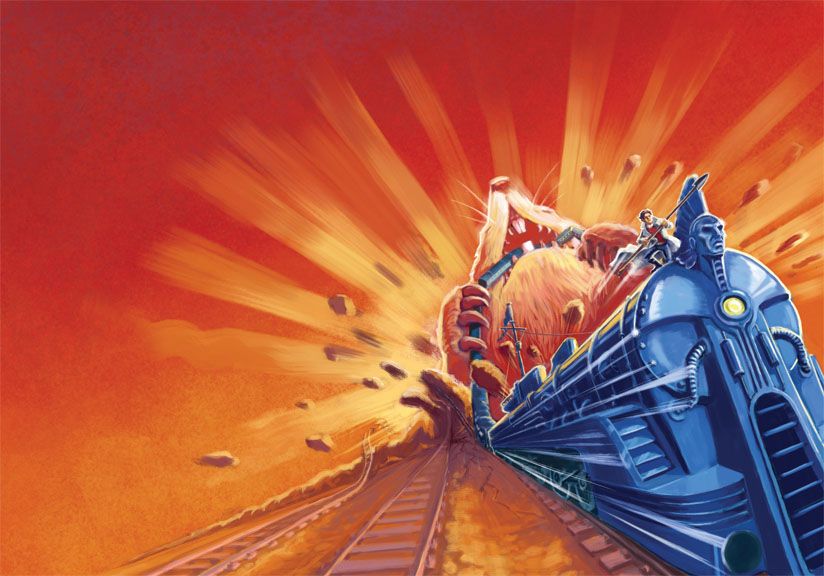
Above is the rough sketch that was chosen as the second route (see my previous post for route 1) to develop for the cover of China Mieville's Railsea. The finished illustration doesn't actually look very different from this initial sketch, but that's not to say I didn't tinker with it endlessly before returning to the original look.

I tried a few variations on the design of the train itself. Part of my inspiration for the redesign were the vintage rail posters that had guided the composition, but another were illustrations of futuristic transport and machinary from science and technology magazines of the 30s. Modern Mechanix had a very particular take on the future. Their covers saw the technology of tomorrow as being beautifully rounded to the point of being bulbous... and red, everything was going to be red in the future apparently.


So I did my Modern Mechanix version of the Mole train Medes. There was a little inspiration too from the Geo Ham motoring illustrations - the chrome side exhausts and the wheel arch styling borrowed from a Delahaye coupe. I wanted to make reference to marine vessels in the design too. This was Rail-sea afterall, and the story itself plays on the story of Melville's Moby Dick. To this end I placed what is essentially the conning tower from a U-boat near the rear of the engine. Out of this protrudes a mast flying a flag, though I didn't go as far as adding sails.
 

I was quite pleased with this look but it didn't go down so well when I asked friends for their opinion. Everyone felt it was overdesigned and just had too much going on. I have to admit that the teardrop styling and red paintwork probably didn't fit very well with the concept of the train being a vessel for hunting giant Moles. It looks more like the sort of thing a Railsea-world movie star would have taken out for a leisurely cruise.

I was casting around again for moletrain inspiration when I came across the vintage rail illustration below by Alexander Leydenfrost. It shows the distinctive Pensylvania Railroad T1 Locamotive, streamlined by Raymond Loewy.


I thought the distinctive wedge shaped nose of the train had something of the look of a U-boat design or possibly the prow of a ship... once again the seafaring connection. It felt like it would make more of a pared down, raw and dangerous vehicle than the portly scarlet predecessor. I also thought the nose design seemed to echo the shape of the Mole, an idea that I liked.. but that may just be me, I probably had moles on the brain by this stage.


I worked up a rough based on my initial route 2 composition, but adding my T1 inspired Moletrain. I'd been asked to take a look at the design of the type for the title too, and found that if I flipped the illustration I could possibly work the title into the tracks running alongside.

I thought I could simplify the design further by limiting the palette to just three colours. I then went even further by suggesting two duotone colourways, which I felt could look quite cool and very striking.


All of this may have been one design change too many however. The panmac design team liked the new sketches but were still really sold on the initial black and white rough sketch I'd shown them, including that pretty simple train design. If 'it ain't broke don't fix it' was the feeling I got, and with the deadline looming I was happy to go with this. So it became a case of going back to the rough and making as good a colour interpretation of that as possible.


Wednesday 8 May 2013

Railsea - route 1

Of the number of initial sketches I submitted for the recent Railsea cover (see last post) the example above was one of two that Pan Macmillan's art director Rachel Vale selected for development.

My initial colour rough for this route (above) just seemed a too predictable, a bit of a pale Ashley Wood or Jon Foster imitation, likely to to get lost amongst a sea of other similarly sepia tinted steampunk covers.

I went back to the source of inspiration suggested by the brief. I wondered if those modernist and art deco rail posters that had suggested the composition and foreshortened speeding trains might also suggest a 'new' palette and a fresh approach to my mark making that would help the cover stand out.

Another point of reference for me were the vintage motoring posters of illustrator Geo Ham. These images seemed to capture the excitement and dynamism that the brief required, but also looked quite different from what you might normally find on a fantasy book cover.
Two of my attempts at dressing my composition up in Ham/Vintage rail styling are shown below.
 

It was a fun exercise but I'm not entirely sure I'd have been the best person to execute this style had it made it to the final stage. None of this was to prove a concern however as it was later decided that this route was to be retired to the sidings in favour of route 2... which we'll meet in the next post.

Thursday 25 April 2013

Railsea roughs


Today the young adult paperback edition of China MiƩville's Railsea found it's way onto UK bookshelves all swathed in my cover design. Above are four roughs I produced when first asked to submit ideas for the cover (please click the image for a less teenieweenie version).

The brief asked for an image of a train with a boy hanging onto the front brandishing a harpoon. The giant mole, and the vast network of rail lines from the novel were optional. Once the possibility of including a giant mole has been raised however it's pretty difficult to prevent yourself crowbarring the critter in somehow.

The main task was to convey the dynamic adventure of the book. My Art Director suggested I look at some vintage rail posters such as the wonderful samples below, for their use of extreme foreshortening in conveying this sense of dynamism. As you can see from the roughs I stuck pretty close to their angles for my trains.

Two of these roughs were selected for development, but more on that in the next post. Railsea is available now from your local bookstore, or online naturally at the usual places. You can still read the first two chapters online here.


Tuesday 16 April 2013

Railsea - young adult cover


Back in July last year I was lucky enough to be asked to provide the cover art for the 'Young Adult' paperback version of China MiƩville's brilliant novel Railsea. I always find it difficult to refuse the chance to draw fantastical locamotives, giant albino moles, and general high adventure.... so I didn't. Finally the results are about to be unleashed on the unsuspecting British public. Above is the cover that will be shunting it's way onto UK bookshelves when it's published on 25th April. The usual (very cool looking) 'old' adult paperback edition is published on the same date.

Below is the final artwork I delivered (click the image for a larger version... if you dare).


As it's usually unwise to judge a book by it's cover alone, the nice people at Tor/Pan Macmillan have allowed you to read the first two chapters here.

I'll be posting more Railsea related stuff here soon in an attempt to work out how we arrived at this final image.

Wednesday 20 March 2013

Ruby's Skin - concept art

 
A pre-production sketch for the short Ruby's Skin, from Slackwire films, shooting in London this April. I didn't get to spend long on this but it was great to work with talented director Claire Tailyour, and help realise her vision. Hopefully we can show some more images from the project in the future.